

Search K
Appearance
Packages workflow data into a chart or table configuration and delivers it to the Insights dashboard as a visual result card.
Use this completion node at the end of a workflow branch that is triggered from an Insights dashboard card. It accepts structured data produced by earlier tasks and formats it as a chart configuration that the dashboard can render immediately. Supported visualisation types range from simple bar and doughnut charts through to multi-series stacked bars, progress cards, label cards, and dynamic tables. Each chart type accepts data either as literal values or as variable references resolved at runtime.
| Field | Type | Required | Description |
|---|---|---|---|
| Chart Type | Dropdown | Yes | Visualisation type to render. Options: Doughnut Chart, Progress Card, Bar Chart, Stacked Bar Chart, Line Chart, Multi-Line Chart, Label Card, Table. |
| Chart Title | Text | No | Title displayed at the top of the dashboard card. |
| Chart SubHeader | Text | No | Optional subtitle shown below the title. |
| Simple Data Field | List | No | Label-value pairs for single-series charts. Each entry has a Label and a numeric Value. Supports variable references. |
| Labels Field | List | No | Category labels for multi-series charts (e.g. Q1, Q2, Q3). Supports variable references to arrays. |
| Values Field | List | No | Data series for multi-series charts. Each entry has a Unit (series name) and a Values array. Supports variable references. |
| Use Alert Colors | Checkbox | No | When checked, colours are assigned based on semantic values such as Success, Warning, and Failed rather than the standard palette. |
| Multi-Color Datasets | Checkbox | No | When checked, each bar or segment receives a distinct colour instead of a uniform dataset colour. |
| Progress Bars Field | List | No | Progress bar definitions for Progress Card. Each entry has Label, Value, and MaxValue. Colours are calculated automatically based on percentage thresholds. |
| Label Text Field | Text | No | Text to display in the Label Card. Supports variable references for dynamic values. |
| Table Data Field | Text | No | Array of objects whose properties become table columns. Supports variable references to arrays from earlier tasks. |
Most fields only appear for certain Chart Type selections. The table below shows which chart types each field is shown for. (Chart Type, Chart Title, and Chart SubHeader are always visible.)
| Field | Shown when Chart Type is |
|---|---|
| Simple Data Field | Doughnut Chart, Bar Chart, Line Chart |
| Labels Field | Stacked Bar Chart, Multi-Line Chart |
| Values Field | Stacked Bar Chart, Multi-Line Chart |
| Use Alert Colors | Doughnut Chart, Bar Chart, Stacked Bar Chart |
| Multi-Color Datasets | Bar Chart, Stacked Bar Chart |
| Progress Bars Field | Progress Card |
| Label Text Field | Label Card |
| Table Data Field | Table |
A stacked bar chart is best understood as a grid. The Labels Field provides the categories along the bottom axis — one bar per label. Each entry in the Values Field is one series (a coloured segment that appears in every bar), made up of a Unit (the series name shown in the legend) and a Values list containing one number per label.
| Q1 | Q2 | Q3 | Q4 | |
|---|---|---|---|---|
| Product A | 10 | 20 | 30 | 40 |
| Product B | 5 | 15 | 25 | 35 |
In this grid the column headers are the Labels, and each row is one Values Field entry (the row name is the Unit, the row's numbers are the Values).
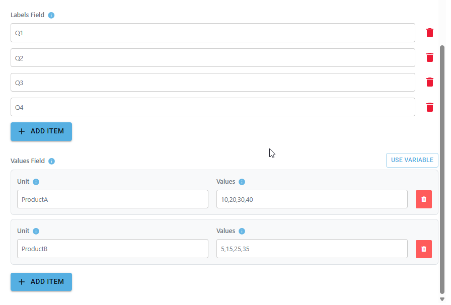
Labels Field — the categories / bars along the x-axis:
["Q1", "Q2", "Q3", "Q4"]Values Field — one object per series. Each Values list holds one number per label, in the same order as the Labels:
[
  { "Unit": "Product A", "Values": [10, 20, 30, 40] },
  { "Unit": "Product B", "Values": [5, 15, 25, 35] }
]
This renders four bars (Q1–Q4), each split into a Product A segment and a Product B segment stacked on top. To add another series, add another object to the Values Field with its own Unit and Values list. Inside a single series' Values box you can enter the numbers either as a bracketed list ([10, 20, 30, 40]) or as a plain comma-separated list (10, 20, 30, 40) — both are accepted.
The Progress Bars Field defines one or more progress bars. Add each bar using the input controls, giving it a Label, a Value, and a MaxValue. The bar fills to Value / MaxValue as a percentage.
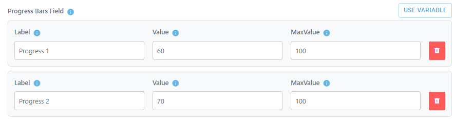
If you prefer to enter the data directly, the field also accepts a JSON array of objects with Label, Value, and MaxValue keys:
[
  { "Label": "Progress 1", "Value": "60", "MaxValue": "100" },
  { "Label": "Progress 2", "Value": "55", "MaxValue": "100" }
]
This renders two progress bars filled to 60% and 55%. The fill colour is determined automatically by the percentage: 0–50% is green, 50–80% is yellow, and 80–100% is red.
The Table Data Field accepts a JSON array of objects. Each object is one row, and each object's keys become the column headers. Keep the keys consistent across every object — the header row is built from the first object only, so a row with different keys will produce misaligned or missing columns.
[
  { "File Name": "Assembly-A100.iam", "Action": "Deleted", "Size (KB)": 512, "Deleted By": "System" },
  { "File Name": "Drawing-D204.dwg", "Action": "Deleted", "Size (KB)": 1280, "Deleted By": "System" },
  { "File Name": "Part-P0091.ipt", "Action": "Skipped", "Size (KB)": 88, "Deleted By": "System" },
  { "File Name": "Spec-S012.pdf", "Action": "Deleted", "Size (KB)": 340, "Deleted By": "System" }
]
This renders a four-column table (File Name / Action / Size (KB) / Deleted By) with four rows.
A minimal two-column example for a quick test:
[
  { "Metric": "Files Deleted", "Value": 100 },
  { "Metric": "Files Skipped", "Value": 12 },
  { "Metric": "Errors", "Value": 0 }
]
Column headers can contain spaces and are used exactly as written. In a live workflow you would usually reference an array produced by an earlier task rather than hardcoding rows — for example {{ApiResponse.data}}, which is what the field's default {{TableData}} placeholder is for.
This task is a completion node. It writes the chart configuration to the Insights dashboard and does not produce output variables for downstream tasks.