Search K
Appearance
Document Composer Studio is the web-based template editor built into MinuteView. When you open or create a template, the Studio editor gives you a canvas and a toolbar of tools for building the document layout.
This page covers every tool available in the toolbar and how to use each one.

The first thing to do when creating a new template is set its name and description. At the top of the Studio editor you will see the template label — a clickable area that shows the current template name.
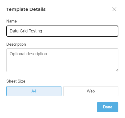
Click the label to open the template properties panel. Here you can:
| Property | Description |
|---|---|
| Name | The template's unique name. This is how it is referenced from Workflow, DocControl, and Configurator — choose a name that describes what the template produces (e.g. Transmittal Cover Sheet, Project Summary Report). |
| Description | Optional. A short explanation of what this template is for and when to use it. Helpful when multiple templates exist and administrators need to distinguish between them. |
Always rename the template before building it out. The default name is a placeholder — a clearly named template is much easier to select correctly when configuring a workflow node or transmittal action.
The Text tool inserts a text box onto the canvas. Use it for headings, body paragraphs, labels, disclaimers, or any block of static or data-driven text.
Click the Text tool in the toolbar, then click on the canvas to place the text box. You can resize it by dragging the edges or corners.
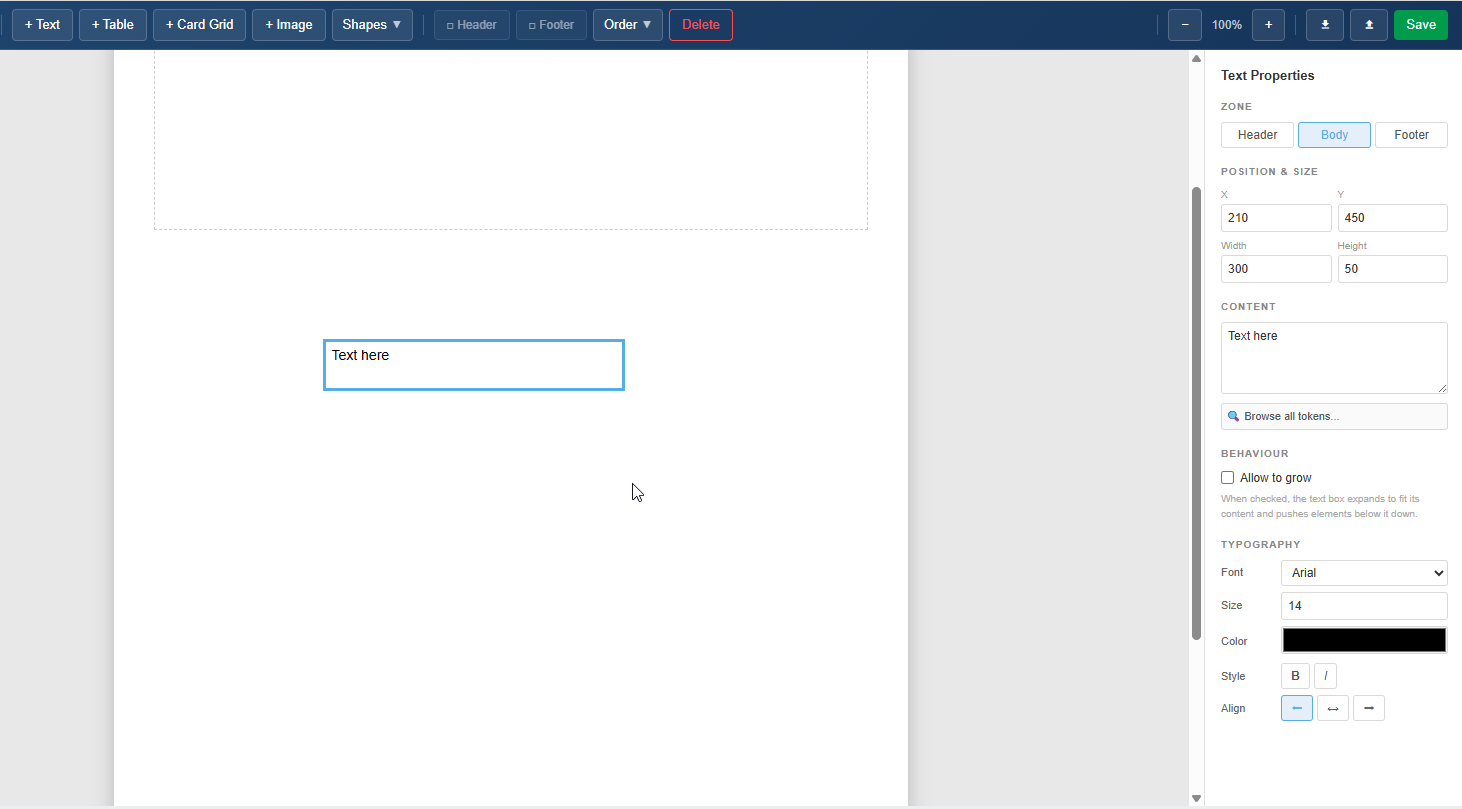
Once placed, click inside the text box to enter edit mode. Type your content directly. The formatting toolbar lets you control:
To insert a live data value into a text box, position your cursor at the point where the value should appear, then open the token browser and click the token you want. The token is inserted as a placeholder that the Engine replaces with the real value at generation time.
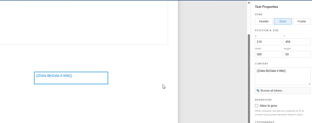
Example: A text box might contain:
Project: [Project.Name] — Prepared by [User.FullName] on [Run.Date]
Where [Project.Name], [User.FullName], and [Run.Date] are tokens drawn from the token browser.
The Table tool inserts a data-driven table onto the canvas. Tables are designed for repeating data — they grow automatically as more rows are added at generation time, making them ideal for document registers, action item lists, BOM tables, or any structured list of records.
Click the Table tool in the toolbar, then click the canvas to place it. The table starts with a set of default columns that you configure to match your data.
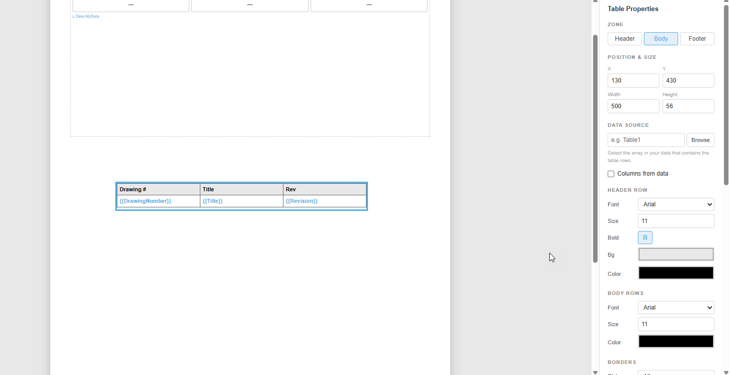
For each column you can set:
| Setting | Description |
|---|---|
| Header Label | The visible column heading shown in the output document |
| Data Token | The token whose value populates each row of this column — selected using the token browser |
| Width | The column width relative to the table |
| Alignment | Cell text alignment (left, centre, right) |
| Format | Optional value formatting (dates, numbers, etc.) |
The table header row can be styled independently from the data rows — set font weight, size, background colour, and text colour to distinguish it clearly.
At generation time, the Engine evaluates the token bound to the table's data source. If that token represents a list of items (e.g. a list of documents, actions, or components), the Engine renders one row per item. The table expands to fit the data — you do not set a fixed number of rows.
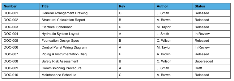
The JSON below shows the structure of the data a table expects. Each object in the array becomes one row in the table.
[
  { "Number": "DOC-001", "Title": "General Arrangement Drawing",    "Revision": "C", "Author": "J. Smith",   "Status": "Released" },
  { "Number": "DOC-002", "Title": "Structural Calculation Report",  "Revision": "B", "Author": "A. Brown",   "Status": "Released" },
  { "Number": "DOC-003", "Title": "Electrical Schematic",          "Revision": "D", "Author": "M. Taylor",  "Status": "Released" },
  { "Number": "DOC-004", "Title": "Hydraulic System Layout",       "Revision": "A", "Author": "J. Smith",   "Status": "In Review" },
  { "Number": "DOC-005", "Title": "Foundation Design Spec",        "Revision": "B", "Author": "C. Wilson",  "Status": "Released" },
  { "Number": "DOC-006", "Title": "Control Panel Wiring Diagram",  "Revision": "A", "Author": "M. Taylor",  "Status": "In Review" },
  { "Number": "DOC-007", "Title": "Piping & Instrumentation Diag", "Revision": "E", "Author": "A. Brown",   "Status": "Released" },
  { "Number": "DOC-008", "Title": "Safety Risk Assessment",        "Revision": "B", "Author": "C. Wilson",  "Status": "Superseded" },
  { "Number": "DOC-009", "Title": "Commissioning Procedure",       "Revision": "A", "Author": "J. Smith",   "Status": "Draft" },
  { "Number": "DOC-010", "Title": "Maintenance Schedule",          "Revision": "C", "Author": "A. Brown",   "Status": "Released" }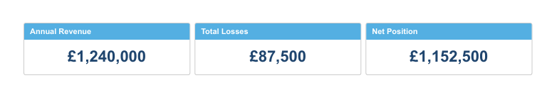
]The Card Grid tool places a grid of cards onto the canvas. Cards are well suited to summary dashboards, KPI displays, project overviews, and any situation where you want to show multiple items at a glance in a visual, tiled layout.
Each card can be as simple as a single label and value, or as detailed as a multi-field summary with status indicators and dates. The grid arranges the cards automatically based on the number of items in the data.
Click the Card Grid tool in the toolbar, then click the canvas to place the grid. Configure the card template — the layout of a single card — and the grid will repeat it for every item in the data source.
Each card can include multiple regions — title, subtitle, value, body text, and so on. You bind each region to a token from the token browser, and the Engine fills each card with the corresponding data from the list.
This example shows a simple card grid used to display four high-level summary figures — the kind you might see at the top of a quarterly report or project status document.
Data structure:
[
    {
        "title": "Annual Revenue",
        "value": "£1,240,000"
    },
    {
        "title": "Total Losses",
        "value": "£87,500"
    },
    {
        "title": "Net Position",
        "value": "£1,152,500"
    }
]
Each card shows the label as the card title and value as a large prominent figure. With four items, the grid produces a single row of four cards.
Output:
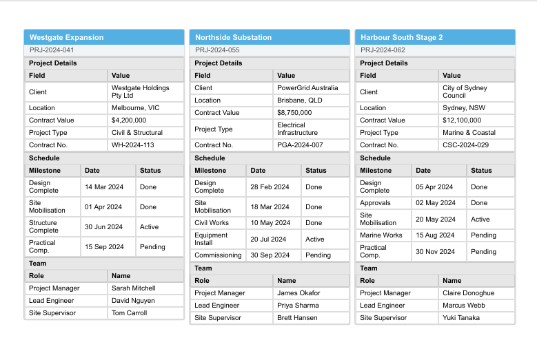
This example shows a more complex card grid where each card summarises a full project record. This is suited to multi-project reports where each card gives a manager a quick snapshot of a project's current state.
Data structure:
[
  {
    "title": "Westgate Expansion",
    "subtitle": "PRJ-2024-041",
    "sections": [
      {
        "heading": "Project Details",
        "columns": ["Field", "Value"],
        "columnWidths": ["120px", "auto"],
        "rows": [
          ["Client",        "Westgate Holdings Pty Ltd"],
          ["Location",      "Melbourne, VIC"],
          ["Contract Value","$4,200,000"],
          ["Project Type",  "Civil & Structural"],
          ["Contract No.",  "WH-2024-113"]
        ],
        "emptyMessage": "—"
      },
      {
        "heading": "Schedule",
        "columns": ["Milestone", "Date", "Status"],
        "columnWidths": ["auto", "80px", "70px"],
        "rows": [
          ["Design Complete",   "14 Mar 2024", "Done"],
          ["Site Mobilisation", "01 Apr 2024", "Done"],
          ["Structure Complete","30 Jun 2024", "Active"],
          ["Practical Comp.",   "15 Sep 2024", "Pending"]
        ],
        "emptyMessage": "—"
      },
      {
        "heading": "Team",
        "columns": ["Role", "Name"],
        "columnWidths": ["120px", "auto"],
        "rows": [
          ["Project Manager", "Sarah Mitchell"],
          ["Lead Engineer",   "David Nguyen"],
          ["Site Supervisor", "Tom Carroll"]
        ],
        "emptyMessage": "—"
      }
    ]
  },
  {
    "title": "Northside Substation",
    "subtitle": "PRJ-2024-055",
    "sections": [
      {
        "heading": "Project Details",
        "columns": ["Field", "Value"],
        "columnWidths": ["120px", "auto"],
        "rows": [
          ["Client",        "PowerGrid Australia"],
          ["Location",      "Brisbane, QLD"],
          ["Contract Value","$8,750,000"],
          ["Project Type",  "Electrical Infrastructure"],
          ["Contract No.",  "PGA-2024-007"]
        ],
        "emptyMessage": "—"
      },
      {
        "heading": "Schedule",
        "columns": ["Milestone", "Date", "Status"],
        "columnWidths": ["auto", "80px", "70px"],
        "rows": [
          ["Design Complete",   "28 Feb 2024", "Done"],
          ["Site Mobilisation", "18 Mar 2024", "Done"],
          ["Civil Works",       "10 May 2024", "Done"],
          ["Equipment Install", "20 Jul 2024", "Active"],
          ["Commissioning",     "30 Sep 2024", "Pending"]
        ],
        "emptyMessage": "—"
      },
      {
        "heading": "Team",
        "columns": ["Role", "Name"],
        "columnWidths": ["120px", "auto"],
        "rows": [
          ["Project Manager", "James Okafor"],
          ["Lead Engineer",   "Priya Sharma"],
          ["Site Supervisor", "Brett Hansen"]
        ],
        "emptyMessage": "—"
      }
    ]
  },
  {
    "title": "Harbour South Stage 2",
    "subtitle": "PRJ-2024-062",
    "sections": [
      {
        "heading": "Project Details",
        "columns": ["Field", "Value"],
        "columnWidths": ["120px", "auto"],
        "rows": [
          ["Client",        "City of Sydney Council"],
          ["Location",      "Sydney, NSW"],
          ["Contract Value","$12,100,000"],
          ["Project Type",  "Marine & Coastal"],
          ["Contract No.",  "CSC-2024-029"]
        ],
        "emptyMessage": "—"
      },
      {
        "heading": "Schedule",
        "columns": ["Milestone", "Date", "Status"],
        "columnWidths": ["auto", "80px", "70px"],
        "rows": [
          ["Design Complete",   "05 Apr 2024", "Done"],
          ["Approvals",         "02 May 2024", "Done"],
          ["Site Mobilisation", "20 May 2024", "Active"],
          ["Marine Works",      "15 Aug 2024", "Pending"],
          ["Practical Comp.",   "30 Nov 2024", "Pending"]
        ],
        "emptyMessage": "—"
      },
      {
        "heading": "Team",
        "columns": ["Role", "Name"],
        "columnWidths": ["120px", "auto"],
        "rows": [
          ["Project Manager", "Claire Donoghue"],
          ["Lead Engineer",   "Marcus Webb"],
          ["Site Supervisor", "Yuki Tanaka"]
        ],
        "emptyMessage": "—"
      }
    ]
  }
]
Each card is laid out with project_name as the card title, status and completion as prominent mid-card fields, and the remaining fields (project_manager, due_date, open_actions, last_submission) as a detail section at the bottom of the card.
Output:
The Image tool inserts an image onto the canvas. Use it for company logos, reference diagrams, project photos, or any static or data-driven visual.
Click the Image tool, then click the canvas to place the image region. You can resize and reposition it on the canvas.
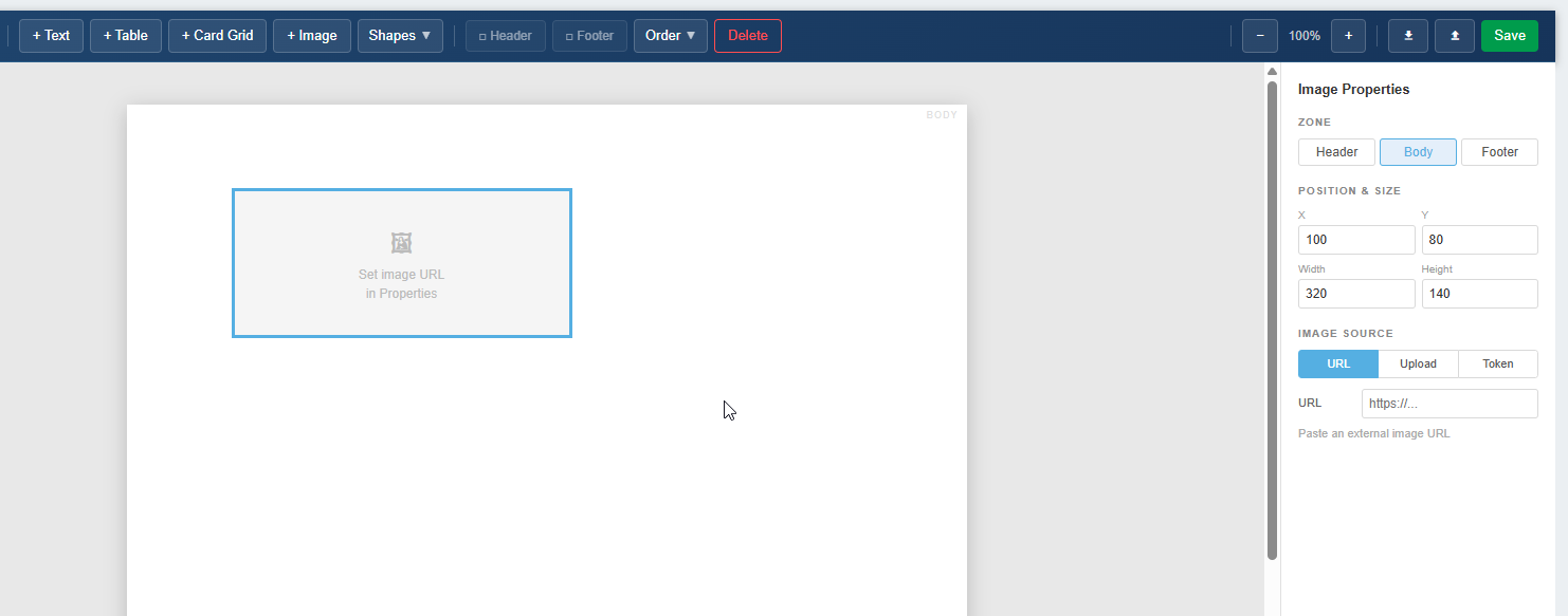
| Source | When to use |
|---|---|
| Upload | Upload an image file directly into the template. Best for fixed images like a company logo that will always be the same. |
| URL | Reference an image by URL. The Engine fetches the image at generation time. Useful for images hosted on a shared drive, SharePoint, or any accessible endpoint. |
| Token | Bind the image source to a token from the token browser. The URL or file path is resolved from the data context at generation time — use this when the image changes per record (e.g. a project photo drawn from workflow data). |
The Shapes tool lets you draw basic geometric shapes onto the canvas — lines, rectangles, and similar primitives. Use shapes for dividers, borders, highlight boxes, or purely decorative layout elements.
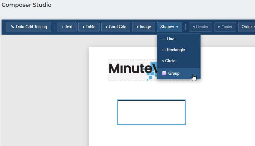
Shapes can be filled and stroked with any colour. They do not support data binding — they are purely visual elements.
When multiple elements overlap on the canvas, draw order controls which element appears on top. You can adjust the draw order of any selected element using the controls in the toolbar or the right-click context menu.
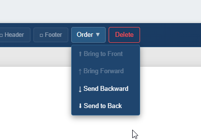
| Action | Effect |
|---|---|
| Send to Front | Moves the selected element in front of all other elements on the canvas |
| Send to Back | Moves the selected element behind all other elements |
Draw order is most commonly used when layering a shape behind a text box, or when overlapping image and text regions to achieve a specific layout.
The Header and Footer are fixed regions that appear at the top and bottom of every page in the generated document. They are configured separately from the main canvas.
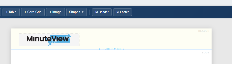
Each section supports the same tools as the main canvas — text boxes with token support, images, shapes — making it straightforward to add:
Content placed in the header or footer repeats on every page of the output document automatically.